 README
README
ui: User Interface Toolkit for Go

Package ui is a user interface toolkit for Go that targets desktop applications (SDL2, for Linux, MacOS and Windows) as well as web browsers (WebAssembly rendering to an HTML Canvas).
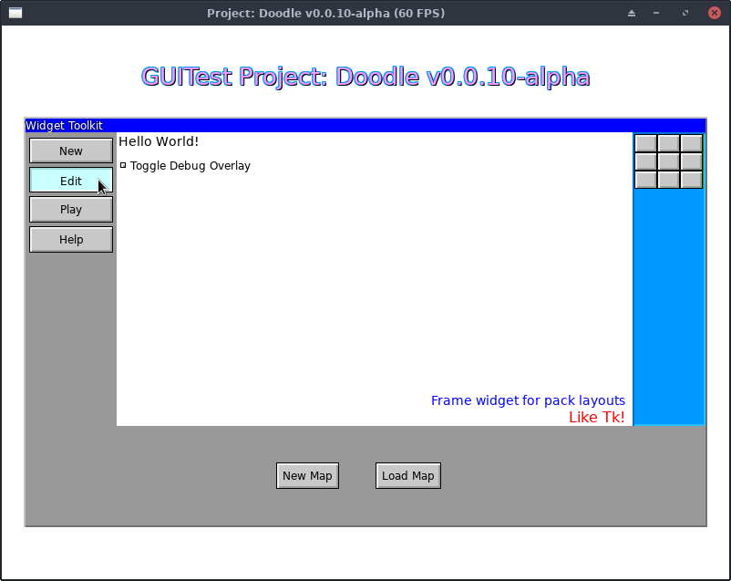
(Screenshot is from Sketchy Maze's GUITest debug screen showing a Window, several Frames, Labels, Buttons and a Checkbox widget.)
It is very much a work in progress and may contain bugs and its API may change as bugs are fixed or features added.
This library is being developed in conjunction with my drawing-based maze game, Sketchy Maze. The rendering engine library is at go/render which provides the SDL2 and Canvas back-ends. (GitHub mirror: kirsle/render)
Notice: the canonical source repository for this project is at git.kirsle.net/go/ui with a mirror available on GitHub at SketchyMaze/ui. Issues and pull requests are accepted on GitHub.
Example
See the eg/ directory in this git repository for several example programs and screenshots.
package main

import (
    "fmt"

    "git.kirsle.net/go/render"
    "git.kirsle.net/go/ui"
)

func main() {
    mw, err := ui.NewMainWindow("Hello World")
    if err != nil {
        panic(err)
    }

    mw.SetBackground(render.White)

    // Draw a label.
    label := ui.NewLabel(ui.Label{
        Text: "Hello, world!",
        Font: render.Text{
            FontFilename: "../DejaVuSans.ttf",
            Size:         32,
            Color:        render.SkyBlue,
            Shadow:       render.SkyBlue.Darken(40),
        },
    })
    mw.Pack(label, ui.Pack{
        Side: ui.N,
        PadY:   12,
    })

    // Draw a button.
    button := ui.NewButton("My Button", ui.NewLabel(ui.Label{
        Text: "Click me!",
        Font: render.Text{
            FontFilename: "../DejaVuSans.ttf",
            Size:         12,
            Color:        render.Red,
            Padding:      4,
        },
    }))
    button.Handle(ui.Click, func(p render.Point) {
        fmt.Println("I've been clicked!")
    })
    mw.Pack(button, ui.Pack{
        Side: ui.N,
    })

    // Add a mouse-over tooltip to the button.
    ui.NewTooltip(button, ui.Tooltip{
        Text: "You know you want to click this button",
        Edge: ui.Right,
    })

    mw.MainLoop()
}
Widgets and Features
The following widgets have been implemented or are planned for the future.
Widgets are designed to be composable, making use of pre-existing widgets to create more complex ones. The widgets here are ordered from simplest to most complex.
Fully implemented widgets:
In order of simplicity:
- BaseWidget: the base class of all Widgets.
- The
Widgetinterface describes the functions common to all Widgets, such as SetBackground, Configure, MoveTo, Resize, and so on. - BaseWidget provides sane default implementations for all the methods required by the Widget interface. Most Widgets inherit from the BaseWidget and override what they need.
- The
- Frame: a layout wrapper for child widgets.
- Pack() lets you add child widgets to the Frame, aligned against one side or another, and ability to expand widgets to take up remaining space in their part of the Frame.
- Place() lets you place child widgets relative to the parent. You can place it at an exact Point, or against the Top, Left, Bottom or Right sides, or aligned to the Center (horizontal) or Middle (vertical) of the parent. Example
- Label: Textual labels for your UI.
- Supports TrueType fonts, color, stroke, drop shadow, font size, etc.
- Variable binding support: TextVariable or IntVariable can point to a string or int reference, respectively, to provide the text of the label dynamically.
- Image: show a PNG or Bitmap image on your UI.
- Button: clickable buttons.
- They can wrap any widget. Labels are most common but can also wrap a Frame so you can have labels + icon images inside the button, etc.
- Mouse hover and click event handlers.
- CheckButton and RadioButton
- Variants on the Button which bind to a variable and toggle its state when clicked. Boolean variable pointers are used with CheckButton and string pointers for RadioButton.
- CheckButtons stay pressed in when clicked (true) and pop back out when clicked again (false).
- RadioButtons stay pressed in when the string variable matches their value, and pop out when the string variable changes.
- Checkbox and Radiobox: a Frame widget that wraps a
CheckButton and a Label to provide a more traditional UI element.
- Works the same as CheckButton and RadioButton but draws a separate label next to a small check button. Clicking the label will toggle the state of the checkbox.
- TabFrame: a collection of Frames navigated between using a row of tab buttons along their top edge. Example.
- Pager: a series of numbered buttons to use with a paginated UI. Includes "Forward" and "Next" buttons and buttons for each page number.
- Window: a Frame with a title bar Frame on top.
- Can be managed by Supervisor to give Window Manager controls to it (drag it by its title bar, Close button, window focus, multiple overlapping windows, and so on). Example
- Tooltip: a mouse hover label attached to a widget. Example
- MenuButton: a button that opens a modal pop-up menu on click.
- MenuBar: a specialized Frame that groups a bunch of MenuButtons and provides a simple API to add menus and items to it.
- Menu: a frame full of clickable links and separators. Usually used as a modal pop-up by the MenuButton and MenuBar. Example
- SelectBox: a kind of MenuButton that lets the user choose a value from a list of possible values.
- Scrollbar: a Frame including a trough, scroll buttons and a draggable slider.
- ListBox: a multi-line select box with a ScrollBar that can hold arbitrary child widgets (usually Labels which have a shortcut function for).
Some useful helper widgets:
- ColorPicker: a ui.Window popup that lets the user choose a color value. It shows a graphical gradient they can click on and an ability to enter a custom hexadecimal value by hand (needs assistance from your program). Example
Planned widgets:
- TextBox: an editable text field that the user can focus and type a value into.
- TextArea: an editable multi-line text field with a scrollbar.
Supervisor for Interaction
Some widgets that support user interaction (such as Button, CheckButton and Checkbox) need to be added to the Supervisor which watches over them and communicates events that they're interested in.
func SupervisorSDL2Example() {
    // NOTE: using the render/sdl engine.
    window := sdl.New("Hello World", 800, 600)
    window.Setup()

    // One Supervisor is needed per UI.
    supervisor := ui.NewSupervisor()

    // A button for our UI.
    btn := ui.NewButton("Button1", ui.NewLabel(ui.Label{
        Text: "Click me!",
    }))

    // Add it to the Supervisor.
    supervisor.Add(btn)

    // Main loop
    for {
        // Check for keyboard/mouse events
        ev, _ := window.Poll()

        // Ping the Supervisor Loop function with the event state, so
        // it can trigger events on the widgets under its care.
        supervisor.Loop(ev)
    }
}
You only need one Supervisor instance per UI. Add() each interactive widget to it, and call its Loop() method in your main loop so it can update the state of the widgets under its care.
The MainWindow includes its own Supervisor, see below.
Window Manager
The ui.Window widget provides a simple frame with a title bar. But, you can use the Supervisor to provide Window Manager controls to your windows!
The key steps to convert a static Window widget into one that can be dragged around by its title bar are:
- Call
window.Supervise(ui.Supervisor)and give it your Supervisor. It will register itself to be managed by the Supervisor. - In your main loop, call
Supervisor.Loop()as you normally would. It handles sending mouse and keyboard events to all managed widgets, including the children of the managed windows. - In the "draw" part of your main loop, call
Supervisor.Present()as the final step. Supervisor will draw the managed windows on top of everything else, with the current focused window on top of the others. Note: managed windows are the only widgets drawn by Supervisor; other widgets should be drawn by their parent widgets in their respective Present() methods.
You can also customize the colors and title bar controls of the managed windows.
Example:
func example() {
    engine, _ := sdl.New("Example", 800, 600)
    supervisor := ui.NewSupervisor()

    win := ui.NewWindow("My Window")

    // Customize the colors of the window. Here are the defaults:
    win.ActiveTitleBackground = render.Blue
    win.ActiveTitleForeground = render.White
    win.InactiveTitleBackground = render.DarkGrey
    win.InactiveTitleForeground = render.Grey

    // Customize the window buttons by ORing the options.
    // NOTE: Maximize behavior is still a work in progress, the window doesn't
    //       redraw itself at the new size correctly yet.
    // NOTE: Minimize button has no default behavior but does trigger a
    //       MinimizeWindow event that you can handle yourself.
    win.SetButtons(ui.CloseButton | ui.MaximizeButton | ui.MinimizeButton)

    // Add widgets to your window.
    label := ui.NewLabel(ui.Label{
       Text: "Hello world!",
    })
    win.Pack(label, ui.Pack{
        Side: ui.W,
    })

    // Compute the window and its children.
    win.Compute(engine)

    // This is the key step: give the window to the Supervisor.
    win.Supervise(supervisor)

    // And in your main loop:
    // NOTE: MainWindow.MainLoop() does this for you automatically.
    for {
        ev, _ = engine.Poll()  // poll render engine for mouse/keyboard events
        supervisor.Loop(ev)
        supervisor.Present(engine)
    }
}
See the eg/windows/ example in the git repository for a full example, including SDL2 and WebAssembly versions.
MainWindow for Simple Applications
The MainWindow widget may be used for "simple" UI applications where all you want is a GUI and you don't want to manage your own SDL2 (or Canvas) engine.
MainWindow is only to be used one time per application, and it sets up its own SDL2 render context and creates the main window. It also contains a Frame widget for the window contents and you may Pack() widgets into the window the same as you would a Frame.
MainWindow includes its own Supervisor: just call the .Add(Widget)
method to add interactive widgets to the supervisor. The MainLoop() of the
window calls Supervisor.Loop() automatically.
License
MIT.
 Documentation
Documentation
Overview 
Package ui provides a user interface toolkit for Go.
The UI toolkit targets SDL2 applications on desktop (Linux, Mac and Windows) or an HTML Canvas render engine for web browsers.
It provides various widgets such as Frame, Label, Button, Checkbox, Radiobox and Tooltip and an event supervisor to monitor the state of the widgets.
Index 
- Constants
- Variables
- func AbsolutePosition(w Widget) render.Point
- func AbsoluteRect(w Widget) render.Rect
- func GetGlyph(b64 string) (image.Image, error)
- func HasParent(w Widget, parent Widget) bool
- func MakeColorPickerGradient() image.Image
- func PrintWidgetTree(root Widget)
- func WidgetTree(root Widget) []string
- type BaseWidget
- func (w *BaseWidget) Background() render.Color
- func (w *BaseWidget) BorderColor() render.Color
- func (w *BaseWidget) BorderSize() int
- func (w *BaseWidget) BorderStyle() BorderStyle
- func (w *BaseWidget) BoxSize() render.Rect
- func (w *BaseWidget) BoxThickness(m int) int
- func (w *BaseWidget) Children() []Widget
- func (w *BaseWidget) Compute(e render.Engine)
- func (w *BaseWidget) Configure(c Config)
- func (w *BaseWidget) Destroy()
- func (w *BaseWidget) DrawBox(e render.Engine, P render.Point)
- func (w *BaseWidget) Event(event Event, e EventData) error
- func (w *BaseWidget) FixedSize() bool
- func (w *BaseWidget) Foreground() render.Color
- func (w *BaseWidget) Handle(event Event, fn func(EventData) error)
- func (w *BaseWidget) Hidden() bool
- func (w *BaseWidget) Hide()
- func (w *BaseWidget) ID() string
- func (w *BaseWidget) IDFunc(fn func() string)
- func (w *BaseWidget) Margin() int
- func (w *BaseWidget) MoveBy(v render.Point)
- func (w *BaseWidget) MoveTo(v render.Point)
- func (w *BaseWidget) OnMouseOut(render.Point)
- func (w *BaseWidget) OutlineColor() render.Color
- func (w *BaseWidget) OutlineSize() int
- func (w *BaseWidget) Parent() (Widget, bool)
- func (w *BaseWidget) Point() render.Point
- func (w *BaseWidget) Present(e render.Engine, p render.Point)
- func (w *BaseWidget) Rect() render.Rect
- func (w *BaseWidget) Resize(v render.Rect)
- func (w *BaseWidget) ResizeAuto(v render.Rect)
- func (w *BaseWidget) ResizeBy(v render.Rect)
- func (w *BaseWidget) SetBackground(c render.Color)
- func (w *BaseWidget) SetBorderColor(c render.Color)
- func (w *BaseWidget) SetBorderSize(v int)
- func (w *BaseWidget) SetBorderStyle(v BorderStyle)
- func (w *BaseWidget) SetForeground(c render.Color)
- func (w *BaseWidget) SetID(id string)
- func (w *BaseWidget) SetMargin(v int)
- func (w *BaseWidget) SetOutlineColor(c render.Color)
- func (w *BaseWidget) SetOutlineSize(v int)
- func (w *BaseWidget) SetParent(parent Widget)
- func (w *BaseWidget) Show()
- func (w *BaseWidget) Size() render.Rect
- func (w *BaseWidget) String() string
- type BorderStyle
- type Button
- type CheckButton
- type Checkbox
- type ColorPicker
- type Config
- type DragDrop
- type Edge
- type Event
- type EventData
- type FocusedWindow
- type Frame
- func (w *Frame) Add(child Widget) error
- func (w *Frame) Children() []Widget
- func (w *Frame) Compute(e render.Engine)
- func (w *Frame) Pack(child Widget, config ...Pack)
- func (w *Frame) Place(child Widget, config Place)
- func (w *Frame) Present(e render.Engine, P render.Point)
- func (w *Frame) Setup()
- func (w *Frame) Unpack(child Widget) bool
- type Image
- type ImageType
- type Label
- type ListBox
- func (w *ListBox) AddLabel(label string, value interface{}, f func())
- func (w *ListBox) Compute(e render.Engine)
- func (w *ListBox) GetStyle() *style.ListBox
- func (w *ListBox) GetValue() (*ListValue, bool)
- func (w *ListBox) Present(e render.Engine, p render.Point)
- func (w *ListBox) SetStyle(v *style.ListBox)
- func (w *ListBox) SetValue(value interface{}) bool
- func (w *ListBox) SetValueByLabel(label string) bool
- func (w *ListBox) Supervise(s *Supervisor)
- type ListValue
- type MainWindow
- func (mw *MainWindow) Add(w Widget)
- func (mw *MainWindow) Attach(w Widget)
- func (mw *MainWindow) Frame() *Frame
- func (mw *MainWindow) Loop() error
- func (mw *MainWindow) MainLoop() error
- func (mw *MainWindow) OnLoop(callback func(*event.State))
- func (mw *MainWindow) Pack(w Widget, pack Pack)
- func (mw *MainWindow) Place(w Widget, config Place)
- func (mw *MainWindow) SetBackground(color render.Color)
- func (mw *MainWindow) SetTitle(title string)
- func (mw *MainWindow) Supervisor() *Supervisor
- type Menu
- func (w *Menu) AddItem(label string, command func()) *MenuItem
- func (w *Menu) AddItemAccel(label string, accelerator string, command func()) *MenuItem
- func (w *Menu) AddSeparator() *MenuItem
- func (w *Menu) Children() []Widget
- func (w *Menu) Compute(e render.Engine)
- func (w *Menu) Pack(item *MenuItem)
- func (w *Menu) Present(e render.Engine, p render.Point)
- func (w *Menu) Rect() render.Rect
- func (w *Menu) Size() render.Rect
- func (w *Menu) Supervise(s *Supervisor)
- type MenuBar
- type MenuButton
- type MenuItem
- type Pack
- type Pager
- type Place
- type ScrollBar
- type SelectBox
- func (w *SelectBox) AddItem(label string, value interface{}, f func())
- func (w *SelectBox) Compute(e render.Engine)
- func (w *SelectBox) GetValue() (SelectValue, bool)
- func (w *SelectBox) SetImage(img *Image)
- func (w *SelectBox) SetValue(value interface{}) bool
- func (w *SelectBox) SetValueByLabel(label string) bool
- type SelectValue
- type Side
- type Supervisor
- func (s *Supervisor) Add(w Widget)
- func (s *Supervisor) CloseActiveWindow() bool
- func (s *Supervisor) CloseAllWindows() int
- func (s *Supervisor) DragStart()
- func (s *Supervisor) DragStartWidget(w Widget)
- func (s *Supervisor) DragStop()
- func (s *Supervisor) DrawOnTop(w Widget)
- func (s *Supervisor) FocusWindow(win *Window) error
- func (s *Supervisor) GetModal() Widget
- func (s *Supervisor) Hovering(cursor render.Point) (hovering, outside []WidgetSlot)
- func (s *Supervisor) IsDragging() bool
- func (s *Supervisor) IsPointInWindow(point render.Point) bool
- func (s *Supervisor) Loop(ev *event.State) error
- func (s *Supervisor) PopModal(w Widget) bool
- func (s *Supervisor) Present(e render.Engine)
- func (s *Supervisor) PrintWindows()
- func (s *Supervisor) PushModal(w Widget) int
- func (s *Supervisor) Widgets() <-chan WidgetSlot
- type TabFrame
- func (w *TabFrame) AddTab(key string, child Widget) *Frame
- func (w *TabFrame) Compute(e render.Engine)
- func (w *TabFrame) Header() *Frame
- func (w *TabFrame) Present(e render.Engine, P render.Point)
- func (w *TabFrame) SetStyle(style *style.Button)
- func (w *TabFrame) SetTab(key string) bool
- func (w *TabFrame) SetTabsHidden(hidden bool)
- func (w *TabFrame) Supervise(supervisor *Supervisor)
- type Tooltip
- type Widget
- type WidgetSlot
- type Window
- func (w *Window) Center(width, height int)
- func (w *Window) Children() []Widget
- func (w *Window) Close()
- func (w *Window) Compute(e render.Engine)
- func (w *Window) Configure(C Config)
- func (w *Window) ConfigureTitle(C Config)
- func (w *Window) ContentFrame() *Frame
- func (w *Window) Destroy()
- func (w *Window) Focused() bool
- func (w *Window) Maximized() bool
- func (w *Window) Pack(child Widget, config ...Pack)
- func (w *Window) Place(child Widget, config Place)
- func (w *Window) Present(e render.Engine, P render.Point)
- func (w *Window) Resize(size render.Rect)
- func (w *Window) SetButtons(buttons int)
- func (w *Window) SetFocus(v bool)
- func (w *Window) SetMaximized(v bool)
- func (w *Window) SetStyle(v *style.Window)
- func (w *Window) Size() render.Rect
- func (w *Window) Supervise(s *Supervisor)
- func (w *Window) TitleBar() (*Frame, *Label)
Examples 
Constants 
const (
	SideMin = Center
	SideMax = NW
)
Range of Side values.
const (
	BMP  ImageType = "bmp"
	PNG            = "png"
	JPEG           = "jpg"
)
Supported image formats.
const (
	BorderNone   BorderStyle = ""
	BorderSolid  BorderStyle = "solid"
	BorderRaised             = "raised"
	BorderSunken             = "sunken"
)
Styles for a widget border.
const (
	CloseButton = 0x01

	// NOTICE: MaximizeButton behavior is currently buggy, window doesn't
	// redraw itself at the new size properly.
	MaximizeButton = 0x02

	// Minimize button has no default behavior attached; you can bind it with
	// window.Handle(MinimizeWindow) to set your own event handler.
	MinimizeButton = 0x04
)
Window button options. OR these together in a call to Window.SetButtons().
const (
	// Downward pointed black arrow 9x9 pixels.
	GlyphDownArrow9x9 = `` /* 186-byte string literal not displayed */

)
List of available glyphs.
const Version = "0.1.0"
Version of the UI toolkit.
Variables 
var (
	DefaultWidth  = 640
	DefaultHeight = 480
)
Default width and height for MainWindow.
var (
	// The caller should STOP forwarding any mouse or keyboard events to any
	// other handles for the remainder of this tick.
	ErrStopPropagation = errors.New("stop all event propagation")
	ErrNoEventHandler  = errors.New("no event handler")
)
Error messages that may be returned by Supervisor.Loop()
var ColorPickerPreset = []string{

	"#FFFFFF",
	"#CCCCCC",
	"#FF0000",
	"#FF9900",
	"#FFFF00",
	"#00FF00",
	"#00FFFF",
	"#FF00FF",
	"#FF9999",
	"#99FF99",

	"#000000",
	"#999999",
	"#990000",
	"#996600",
	"#999900",
	"#009900",
	"#009999",
	"#000099",
	"#990099",
	"#9999FF",
	"#FFFF99",
}
ColorPickerPreset shows the preset color buttons. Suggested to have 18 colors which is displayed in 2 rows of 9 buttons. More presets may need larger than default window size to fit.
var DefaultColorPickerSize = render.Rect{W: 240, H: 190}
DefaultColorPickerSize sets the default window size used in NewColorPicker unless the user specified overrides.
var DefaultFont = render.Text{
	Size:  12,
	Color: render.Black,
}
DefaultFont is the default font settings used for a Label.
var (
	FPS = 60
)
Target frames per second for the MainWindow to render at.
var MenuFont = render.Text{
	Size:  12,
	Color: render.Black,
	PadX:  4,
	PadY:  2,
}
MenuFont is the default font settings for MenuBar buttons.
var MenuWidth = 180
MenuWidth sets the width of all popup menus. TODO, widths should be automatic.
var Theme = theme.Default
Theme sets the default theme used when creating new widgets.
Functions 
func AbsolutePosition 
AbsolutePosition computes a widget's absolute X,Y position on the window on screen by crawling its parent widget tree.
func AbsoluteRect 
AbsoluteRect returns a Rect() offset with the absolute position. X and Y are the AbsolutePosition of the widget. W and H are the widget's width and height. (X,Y not added to them)
func HasParent 
HasParent returns whether the target widget is a descendant of the parent. This scans the parents of the widget recursively until it finds a match.
func MakeColorPickerGradient 
Load the color spectrum image.
func PrintWidgetTree 
func PrintWidgetTree(root Widget)
PrintWidgetTree prints a widget tree to console.
func WidgetTree 
WidgetTree returns a string representing the tree of widgets starting at a given widget.
Types 
type BaseWidget 
type BaseWidget struct {
	// contains filtered or unexported fields
}
BaseWidget holds common functionality for all widgets, such as managing their widths and heights.
func (*BaseWidget) Background 
func (w *BaseWidget) Background() render.Color
Background returns the background color.
func (*BaseWidget) BorderColor 
func (w *BaseWidget) BorderColor() render.Color
BorderColor returns the border color, or defaults to the background color.
func (*BaseWidget) BorderSize 
func (w *BaseWidget) BorderSize() int
BorderSize returns the border thickness.
func (*BaseWidget) BorderStyle 
func (w *BaseWidget) BorderStyle() BorderStyle
BorderStyle returns the border style.
func (*BaseWidget) BoxSize 
func (w *BaseWidget) BoxSize() render.Rect
BoxSize returns the full rendered size of the widget including its box thickness (border, padding and outline).
func (*BaseWidget) BoxThickness 
func (w *BaseWidget) BoxThickness(m int) int
BoxThickness returns the full sum of the padding, border and outline. m = multiplier, i.e., 1 or 2. If m=1 this returns the box thickness of one edge of the widget, if m=2 it would account for both edges of the widget.
func (*BaseWidget) Children 
func (w *BaseWidget) Children() []Widget
Children returns the widget's children, to be implemented by containers. The default implementation returns an empty slice.
func (*BaseWidget) Compute 
func (w *BaseWidget) Compute(e render.Engine)
Compute calls the base widget's Compute function, which just triggers events on widgets that want to be notified when the widget computes.
func (*BaseWidget) Configure 
func (w *BaseWidget) Configure(c Config)
Configure the base widget with all the common properties at once. Any property left as the zero value will not update the widget.
func (*BaseWidget) Destroy 
func (w *BaseWidget) Destroy()
Destroy does nothing on the base widget. Implement it for widgets which need it.
func (*BaseWidget) DrawBox 
func (w *BaseWidget) DrawBox(e render.Engine, P render.Point)
DrawBox draws the border and outline.
func (*BaseWidget) Event 
func (w *BaseWidget) Event(event Event, e EventData) error
Event is called internally by Doodle to trigger an event. Handlers can return ErrStopPropagation to prevent further widgets being notified of events.
func (*BaseWidget) FixedSize 
func (w *BaseWidget) FixedSize() bool
FixedSize returns whether the widget's size has been hard-coded by the user (true) or if it automatically resizes based on its contents (false).
func (*BaseWidget) Foreground 
func (w *BaseWidget) Foreground() render.Color
Foreground returns the foreground color.
func (*BaseWidget) Handle 
func (w *BaseWidget) Handle(event Event, fn func(EventData) error)
Handle an event in the widget.
func (*BaseWidget) Hidden 
func (w *BaseWidget) Hidden() bool
Hidden returns whether the widget is hidden. If this widget is not hidden, but it has a parent, this will recursively crawl the parents to see if any of them are hidden.
func (*BaseWidget) ID 
func (w *BaseWidget) ID() string
ID returns the ID that the widget calls itself by.
func (*BaseWidget) IDFunc 
func (w *BaseWidget) IDFunc(fn func() string)
IDFunc sets an ID function.
func (*BaseWidget) MoveBy 
func (w *BaseWidget) MoveBy(v render.Point)
MoveBy adds the X,Y values to the widget's current position.
func (*BaseWidget) MoveTo 
func (w *BaseWidget) MoveTo(v render.Point)
MoveTo updates the X,Y position to the new point.
func (*BaseWidget) OnMouseOut 
func (w *BaseWidget) OnMouseOut(render.Point)
OnMouseOut should be overridden on widgets who want this event.
func (*BaseWidget) OutlineColor 
func (w *BaseWidget) OutlineColor() render.Color
OutlineColor returns the background color.
func (*BaseWidget) OutlineSize 
func (w *BaseWidget) OutlineSize() int
OutlineSize returns the outline thickness.
func (*BaseWidget) Parent 
func (w *BaseWidget) Parent() (Widget, bool)
Parent returns the parent widget, like a Frame, and a boolean indicating whether the widget had a parent.
func (*BaseWidget) Point 
func (w *BaseWidget) Point() render.Point
Point returns the X,Y position of the widget on the window.
func (*BaseWidget) Present 
func (w *BaseWidget) Present(e render.Engine, p render.Point)
Present calls the base widget's Present function, which just triggers events on widgets that want to be notified when the widget presents.
func (*BaseWidget) Rect 
func (w *BaseWidget) Rect() render.Rect
Rect returns the widget's absolute rectangle, the combined Size and Point.
func (*BaseWidget) Resize 
func (w *BaseWidget) Resize(v render.Rect)
Resize sets the size of the widget to the .W and .H attributes of a rect.
func (*BaseWidget) ResizeAuto 
func (w *BaseWidget) ResizeAuto(v render.Rect)
ResizeAuto sets the size of the widget but doesn't set the fixedSize flag.
func (*BaseWidget) ResizeBy 
func (w *BaseWidget) ResizeBy(v render.Rect)
ResizeBy resizes by a relative amount.
func (*BaseWidget) SetBackground 
func (w *BaseWidget) SetBackground(c render.Color)
SetBackground sets the color.
func (*BaseWidget) SetBorderColor 
func (w *BaseWidget) SetBorderColor(c render.Color)
SetBorderColor sets the border color.
func (*BaseWidget) SetBorderSize 
func (w *BaseWidget) SetBorderSize(v int)
SetBorderSize sets the border thickness.
func (*BaseWidget) SetBorderStyle 
func (w *BaseWidget) SetBorderStyle(v BorderStyle)
SetBorderStyle sets the border style.
func (*BaseWidget) SetForeground 
func (w *BaseWidget) SetForeground(c render.Color)
SetForeground sets the color.
func (*BaseWidget) SetID 
func (w *BaseWidget) SetID(id string)
SetID sets a string name for your widget, helpful for debugging purposes.
func (*BaseWidget) SetMargin 
func (w *BaseWidget) SetMargin(v int)
SetMargin sets the margin width.
func (*BaseWidget) SetOutlineColor 
func (w *BaseWidget) SetOutlineColor(c render.Color)
SetOutlineColor sets the color.
func (*BaseWidget) SetOutlineSize 
func (w *BaseWidget) SetOutlineSize(v int)
SetOutlineSize sets the outline thickness.
func (*BaseWidget) SetParent 
func (w *BaseWidget) SetParent(parent Widget)
SetParent sets the widget's parent. This function is called by container widgets like Frame when they add a child widget to their care. Pass a nil parent to unset the parent.
func (*BaseWidget) Size 
func (w *BaseWidget) Size() render.Rect
Size returns the box with W and H attributes containing the size of the widget. The X,Y attributes of the box are ignored and zero.
func (*BaseWidget) String 
func (w *BaseWidget) String() string
type Button 
type Button struct {
	BaseWidget
	Name string

	// Set this true to hard-set a color for this button;
	// it will not adjust on mouse-over or press.
	FixedColor bool
	// contains filtered or unexported fields
}
Button is a clickable button.
type CheckButton 
CheckButton implements a checkbox and radiobox widget. It's based on a Button and holds a boolean or string pointer (boolean for checkbox, string for radio).
func NewCheckButton 
func NewCheckButton(name string, boolVar *bool, child Widget) *CheckButton
NewCheckButton creates a new CheckButton.
func NewRadioButton 
func NewRadioButton(name string, stringVar *string, value string, child Widget) *CheckButton
NewRadioButton creates a CheckButton bound to a string variable.
func (*CheckButton) Compute 
func (w *CheckButton) Compute(e render.Engine)
Compute to re-evaluate the button state (in the case of radio buttons where a different button will affect the state of this one when clicked).
type Checkbox 
type Checkbox struct {
	Frame
	// contains filtered or unexported fields
}
Checkbox combines a CheckButton with a widget like a Label.
func NewCheckbox 
NewCheckbox creates a new Checkbox.
func NewRadiobox 
NewRadiobox creates a new Checkbox in radio mode.
func (*Checkbox) Supervise 
func (w *Checkbox) Supervise(s *Supervisor)
Supervise the checkbutton inside the widget.
type ColorPicker 
type ColorPicker struct {
	*Window

	// Config settings.
	Title      string
	Color      render.Color // initial color selection
	Supervisor *Supervisor
	Engine     render.Engine

	// Callback function in case the user wants to manually enter a hex color code.
	// Your program should prompt them by any means and return their chosen color.
	// Return a zero color (render.Invisible) to mean cancel.
	OnManualInput func(callback func(render.Color))
	// contains filtered or unexported fields
}
ColorPicker is a Window that allows the user to pick out a color.
func NewColorPicker 
func NewColorPicker(config ColorPicker, dimensions ...int) (*ColorPicker, error)
NewColorPicker creates a new ColorPicker window. Specify the dimensions you want the window to appear in (width, height int) to specify a desired window size or else the default will be DefaultColorPickerSize.
func (*ColorPicker) Destroy 
func (w *ColorPicker) Destroy()
Destroy the ColorPicker widget. Call this instead of Hide() if you close the widget programmatically! It will free up SDL textures and so on.
func (*ColorPicker) OnCancel 
func (w *ColorPicker) OnCancel(callback func())
OnCancel is a callback to handle the ColorPicker being dismissed by the user.
func (*ColorPicker) Then 
func (w *ColorPicker) Then(callback func(render.Color))
Then is a callback function when the user has chosen a color.
type Config 
type Config struct {
	// Size management. If you provide a non-zero value for Width and Height,
	// the widget will be resized and the "fixedSize" flag is set, meaning it
	// will not re-compute its size dynamically. To set the size while also
	// keeping the auto-resize property, pass AutoResize=true too. This is
	// mainly used internally when widgets are calculating their automatic sizes.
	AutoResize   bool
	Width        int
	Height       int
	Margin       int
	MarginX      int
	MarginY      int
	Background   render.Color
	Foreground   render.Color
	BorderSize   int
	BorderStyle  BorderStyle
	BorderColor  render.Color
	OutlineSize  int
	OutlineColor render.Color
}
Config holds common base widget configs for quick configuration.
type DragDrop 
type DragDrop struct {
	// contains filtered or unexported fields
}
DragDrop is a state machine to manage draggable UI components.
func NewDragDrop 
func NewDragDrop() *DragDrop
NewDragDrop initializes the DragDrop struct. Normally your Supervisor will manage the drag/drop object, but you can use your own if you don't use a Supervisor.
func (*DragDrop) IsDragging 
IsDragging returns whether the drag state is active.
func (*DragDrop) SetWidget 
SetWidget attaches the widget to the drag state, but does not start the drag; you call Start() after this if the subject is a widget.
type Event 
type Event int
Event is a named event that the supervisor will send.
const (
	NullEvent Event = iota
	MouseOver
	MouseMove
	MouseOut
	MouseDown
	MouseUp
	Click
	KeyDown
	KeyUp
	KeyPress
	Scroll

	// Drag/drop event handlers.
	DragStop // if a widget is being dragged and the drag is done
	DragMove // mouse movements sent to a widget being dragged.
	Drop     // a "drop site" widget under the cursor when a drag is done

	// Window Manager events.
	CloseWindow
	MaximizeWindow
	MinimizeWindow
	CloseModal

	// Lifecycle event handlers.
	Compute // fired whenever the widget runs Compute
	Present // fired whenever the widget runs Present

	// Form field events.
	Change
)
Events.
type EventData 
type EventData struct {
	// Point is usually the cursor position on click and mouse events.
	Point render.Point

	// Engine is the render engine on Compute and Present events.
	Engine render.Engine

	// Supervisor is the reference to the supervisor who sent the event.
	Supervisor *Supervisor

	// Widget is a reference to the widget receiving the event.
	Widget Widget

	// Clicked is true if the primary mouse button is down during
	// a MouseMove
	Clicked bool

	// A Value given e.g. from a ListBox click.
	Value interface{}

	// Scroll event values.
	ScrollFraction float64 // between 0 and 1 for the scrollbar percentage

	// Number of units that have scrolled. It is up to the caller to decide
	// what units mean (e.g. characters, lines of text, pixels, etc.)
	// The scrollbar fraction times your Step value provides the units.
	ScrollUnits int

	// Number of pages that have scrolled. It is up to the caller to decide
	// what a page is. It would typically be a number of your Units slightly
	// less than what fits in the list so the user sees some overlap as
	// they scroll quickly by pages.
	ScrollPages int // TODO: not implemented
}
EventData carries common data to event handlers.
func (EventData) RelativePoint 
RelativePoint returns the ed.Point adjusted to be relative to the widget on screen.
type FocusedWindow 
type FocusedWindow struct {
	// contains filtered or unexported fields
}
FocusedWindow is a doubly-linked list of recently focused Windows, with the current and most-recently focused on top. TODO make not exported.
func (*FocusedWindow) Print 
func (fw *FocusedWindow) Print()
Print the structure of the linked list from top to bottom.
func (FocusedWindow) String 
func (fw FocusedWindow) String() string
String of the FocusedWindow returns the underlying Window's String().
type Frame 
type Frame struct {
	Name string
	BaseWidget
	// contains filtered or unexported fields
}
Frame is a widget that contains other widgets.
func (*Frame) Add 
Add a child widget to the frame. When the frame Presents itself, it also presents child widgets. This method is safe to call multiple times: it ensures the widget is not already a child of the Frame before adding it.
func (*Frame) Place 
Place a widget into the frame. You may call Place on a widget multiple times to update its configuration.
type Image 
type Image struct {
	BaseWidget

	// Configurable fields for the constructor.
	Type  ImageType
	Image image.Image // a Go image version
	// contains filtered or unexported fields
}
Image is a widget that is backed by an image file.
func ImageFromFile 
ImageFromFile creates an Image by opening a file from disk.
func ImageFromImage 
ImageFromImage creates an Image from a Go standard library image.Image.
func ImageFromTexture 
ImageFromTexture creates an Image from a texture.
func OpenImage 
OpenImage initializes an Image with a given file name.
The file extension is important and should be a supported ImageType.
func (*Image) Destroy 
func (w *Image) Destroy()
Destroy cleans up the image and releases textures.
func (*Image) Present 
Present the widget. This should be called on your main thread if using SDL2 in case it needs to generate textures.
func (*Image) ReplaceFromImage 
ReplaceFromImage replaces the image with a new image.
type Label 
type Label struct {
	BaseWidget

	// Configurable fields for the constructor.
	Text         string
	TextVariable *string
	IntVariable  *int
	Font         render.Text
	// contains filtered or unexported fields
}
Label is a simple text label widget.
type ListBox 
type ListBox struct {
	*Frame

	// Variable bindings: give these pointers to your values.
	Variable interface{} // pointer to e.g. a string or int
	// contains filtered or unexported fields
}
ListBox is a selectable list of values like a multi-line SelectBox.
func NewListBox 
NewListBox creates a new ListBox.
func (*ListBox) AddLabel 
AddLabel adds a simple text-based label to the Listbox. The label is the text value to display. The value is the underlying value (string or int) for the TextVariable or IntVariable. The function callback runs when the option is picked.
func (*ListBox) Compute 
Compute to re-evaluate the button state (in the case of radio buttons where a different button will affect the state of this one when clicked).
func (*ListBox) GetValue 
GetValue returns the currently selected item in the ListBox.
Returns the SelectValue and true on success, and the Label or underlying Value can be read from the SelectValue struct. If no valid option is selected, the bool value returns false.
func (*ListBox) SetValueByLabel 
SetValueByLabel sets the currently selected option to the given label.
func (*ListBox) Supervise 
func (w *ListBox) Supervise(s *Supervisor)
Supervise the ListBox. This is necessary for granting mouse-over events to the items in the list.
type ListValue 
ListValue is an item in the ListBox. It has an arbitrary widget as a "label" (usually a Label) and a value (string or int) when it's "selected"
type MainWindow 
MainWindow is the parent window of a UI application.
func NewMainWindow 
func NewMainWindow(title string, dimensions ...int) (*MainWindow, error)
NewMainWindow initializes the MainWindow. You should probably only have one of these per application. Dimensions are the width and height of the window.
Example: NewMainWindow("Title Bar") // default 640x480 window NewMainWindow("Title", 800, 600) // both required
func (*MainWindow) Add 
func (mw *MainWindow) Add(w Widget)
Add a child widget to the window's supervisor. This alone does not make the child widget render each frame; use Pack, Place or Attach for that.
func (*MainWindow) Attach 
func (mw *MainWindow) Attach(w Widget)
Attach a child widget to the window without its position managed. The widget's Present() method will be called each time the window Presents, but the positioning of the child widget must be handled manually by the caller.
Pack and Place are usually the methods you want to use to put a child widget into the window. One example use case for Attach is when you want to create child Window widgets which can be dragged by their title bars; their dynamic drag-drop positioning is best managed manually, and Pack or Place would interfere with their positioning otherwise.
This also calls .Add() to add the widget to the MainWindow's Supervisor.
Implementation details: - Adds the widget to the MainWindow's Supervisor. - Calls Frame.Add(w) so it will Present each time the main frame Presents. - Calls w.Compute() on your widget so it can calculate its initial size.
func (*MainWindow) Frame 
func (mw *MainWindow) Frame() *Frame
Frame returns the window's main frame, if needed.
func (*MainWindow) MainLoop 
func (mw *MainWindow) MainLoop() error
MainLoop starts the main event loop and blocks until there's an error.
func (*MainWindow) OnLoop 
func (mw *MainWindow) OnLoop(callback func(*event.State))
OnLoop registers a function to be called on every loop of the main window. This enables your application to register global event handlers or whatnot. The function is called between the event polling and the updating of any UI elements.
func (*MainWindow) Pack 
func (mw *MainWindow) Pack(w Widget, pack Pack)
Pack a child widget into the window's default frame.
func (*MainWindow) Place 
func (mw *MainWindow) Place(w Widget, config Place)
Place a child widget into the window's default frame.
func (*MainWindow) SetBackground 
func (mw *MainWindow) SetBackground(color render.Color)
SetBackground changes the window's frame's background color.
func (*MainWindow) SetTitle 
func (mw *MainWindow) SetTitle(title string)
SetTitle changes the title of the window.
func (*MainWindow) Supervisor 
func (mw *MainWindow) Supervisor() *Supervisor
Supervisor returns the window's Supervisor instance.
type Menu 
type Menu struct {
	BaseWidget
	Name string
	// contains filtered or unexported fields
}
Menu is a frame that holds menu items. It is the
Example 
Example of using the menu widgets.
package main

import (
	"git.kirsle.net/go/ui"
)

func main() {
	mw, err := ui.NewMainWindow("Menu Bar Example", 800, 600)
	if err != nil {
		panic(err)
	}

	// Create a main menu for your window.
	menu := ui.NewMenuBar("Main Menu")

	// File menu. Some items with accelerators, some without.
	// NOTE: key bindings are up to you, the accelerators are
	// purely decorative.
	file := menu.AddMenu("File")
	file.AddItemAccel("New", "Ctrl-N", func() {})
	file.AddItemAccel("Open", "Ctrl-O", func() {})
	file.AddItemAccel("Save", "Ctrl-S", func() {})
	file.AddItem("Save as...", func() {})
	file.AddSeparator()
	file.AddItem("Close window", func() {})
	file.AddItemAccel("Exit", "Alt-F4", func() {})

	// Help menu.
	help := menu.AddMenu("Help")
	help.AddItemAccel("Contents", "F1", func() {})
	help.AddItem("About", func() {})

	// Give the menu bar your Supervisor so it can wire all
	// events up and make the menus work.
	menu.Supervise(mw.Supervisor())

	// Compute and pack the menu bar against the top of
	// the main window (or other parent container)
	menu.Compute(mw.Engine)
	mw.Pack(menu, menu.PackTop()) // Side: N, FillX: true

	// Each loop you must then:
	// - Call Supervisor.Loop() as normal to handle events.
	// - Call Supervisor.Present() to draw the modal popup menus.
	// MainLoop() of the MainWindow does this for you.
	mw.MainLoop()
}
Output:
func NewMenu 
NewMenu creates a new Menu. It is hidden by default. Usually you'll use it with a MenuButton or in a right-click handler.
func (*Menu) AddItemAccel 
AddItemAccel quickly adds an item to a menu with a shortcut key label.
func (*Menu) AddSeparator 
AddSeparator adds a separator bar to the menu to delineate items.
func (*Menu) Supervise 
func (w *Menu) Supervise(s *Supervisor)
Supervise the Menu. This will add all current and future MenuItem widgets to the supervisor.
type MenuBar 
type MenuBar struct {
	Frame
	// contains filtered or unexported fields
}
MenuBar is a frame that holds several MenuButtons, such as for the main menu at the top of a window.
func (*MenuBar) AddMenu 
func (w *MenuBar) AddMenu(label string) *MenuButton
AddMenu adds a new menu button to the bar. Returns the MenuButton object so that you can add items to it.
func (*MenuBar) PackTop 
PackTop returns the default Frame Pack settings to place the menu at the top of the parent widget.
func (*MenuBar) Supervise 
func (w *MenuBar) Supervise(s *Supervisor)
Supervise the menu bar, making its child menu buttons work correctly.
type MenuButton 
type MenuButton struct {
	Button
	// contains filtered or unexported fields
}
MenuButton is a button that opens a menu when clicked.
After creating a MenuButton, call AddItem() to add options and callback functions to fill out the menu. When the MenuButton is clicked, its menu will be drawn and take modal priority in the Supervisor.
Example 
Example of using the MenuButton.
package main

import (
	"git.kirsle.net/go/ui"
)

func main() {
	mw, err := ui.NewMainWindow("Menu Button", 800, 600)
	if err != nil {
		panic(err)
	}

	// Create a MenuButton much as you would a normal Button.
	btn := ui.NewMenuButton("Button1", ui.NewLabel(ui.Label{
		Text: "File",
	}))
	mw.Place(btn, ui.Place{ // place it in the center
		Center: true,
		Middle: true,
	})

	// Add menu items to it.
	btn.AddItemAccel("New", "Ctrl-N", func() {})
	btn.AddItemAccel("Open", "Ctrl-O", func() {})
	btn.AddItemAccel("Save", "Ctrl-S", func() {})
	btn.AddItem("Save as...", func() {})
	btn.AddSeparator()
	btn.AddItem("Close window", func() {})
	btn.AddItemAccel("Exit", "Alt-F4", func() {})

	// Add the button to Supervisor for events to work.
	btn.Supervise(mw.Supervisor())

	// Each loop you must then:
	// - Call Supervisor.Loop() as normal to handle events.
	// - Call Supervisor.Present() to draw the modal popup menus.
	// MainLoop() of the MainWindow does this for you.
	mw.MainLoop()
}
Output:
func NewMenuButton 
func NewMenuButton(name string, child Widget) *MenuButton
NewMenuButton creates a new MenuButton (labels recommended).
If the child is a Label, this function will set some sensible padding on its font if the Label does not already have non-zero padding set.
func (*MenuButton) AddItem 
func (w *MenuButton) AddItem(label string, f func())
AddItem adds a new option to the MenuButton's menu.
func (*MenuButton) AddItemAccel 
func (w *MenuButton) AddItemAccel(label string, accelerator string, f func()) *MenuItem
AddItemAccel adds a new menu option with hotkey text.
func (*MenuButton) AddSeparator 
func (w *MenuButton) AddSeparator()
AddSeparator adds a separator to the menu.
func (*MenuButton) Compute 
func (w *MenuButton) Compute(e render.Engine)
Compute to re-evaluate the button state (in the case of radio buttons where a different button will affect the state of this one when clicked).
func (*MenuButton) Supervise 
func (w *MenuButton) Supervise(s *Supervisor)
Supervise the MenuButton. This is necessary for the pop-up menu to work when the button is clicked.
type MenuItem 
type MenuItem struct {
	Button
	Label       string
	Accelerator string
	Command     func()
	// contains filtered or unexported fields
}
MenuItem is an item in a Menu.
func NewMenuItem 
NewMenuItem creates a new menu item.
func NewMenuSeparator 
func NewMenuSeparator() *MenuItem
NewMenuSeparator creates a separator menu item.
type Pack 
type Pack struct {
	// Side of the parent to anchor the position to, like N, SE, W. Default
	// is Center.
	Side Side

	// If the widget is smaller than its allocated space, grow the widget
	// to fill its space in the Frame.
	Fill  bool
	FillX bool
	FillY bool

	Padding int // Equal padding on X and Y.
	PadX    int
	PadY    int
	Expand  bool // Widget should grow its allocated space to better fill the parent.
}
Pack provides configuration fields for Frame.Pack().
type Pager 
type Pager struct {
	BaseWidget

	// Config settings. NOTE: these are copied in the constructor,
	// be sure to update it there too if you add a new option!
	Name           string // totally optional name
	Page           int    // default 1
	Pages          int
	PerPage        int // default 20
	MaxPageButtons int // max no. of individual pages to show, 0 = no limit
	Font           render.Text
	OnChange       func(page, perPage int)
	// contains filtered or unexported fields
}
Pager is a frame with Pagers for paginated UI.
func (*Pager) Supervise 
func (w *Pager) Supervise(s *Supervisor)
Supervise the pager to make its buttons work.
type Place 
type Place struct {
	// X and Y coordinates for explicit location of widget within its parent.
	// This placement option trumps all others.
	Point render.Point

	// Place relative to an edge of the window. The widget will stick to the
	// edge of the window even as it resizes. Options are ignored if Point
	// is set.
	Top    int
	Left   int
	Right  int
	Bottom int
	Center bool
	Middle bool
}
Place provides configuration fields for Frame.Place().
type ScrollBar 
type ScrollBar struct {
	*Frame

	// Configurable scroll ranges.
	Min  int
	Max  int
	Step int

	// Variable bindings: give these pointers to your values.
	Variable interface{} // pointer to e.g. a string or int
	// contains filtered or unexported fields
}
ScrollBar is a classic scrolling widget.
func NewScrollBar 
NewScrollBar creates a new ScrollBar.
func (*ScrollBar) Compute 
Compute to re-evaluate the button state (in the case of radio buttons where a different button will affect the state of this one when clicked).
func (*ScrollBar) Supervise 
func (w *ScrollBar) Supervise(s *Supervisor)
Supervise the ScrollBar. This is necessary for granting mouse-over events to the items in the list.
type SelectBox 
type SelectBox struct {
	MenuButton

	// Configurables after SelectBox creation.
	AlwaysChange bool // always call the Change event, even if selection not changed.
	// contains filtered or unexported fields
}
SelectBox is a kind of MenuButton which allows choosing a value from a list.
func NewSelectBox 
NewSelectBox creates a new SelectBox.
The Label configuration passed in should be used to set font styles and padding; the Text, TextVariable and IntVariable of the Label will all be ignored, as SelectBox will handle the values internally.
func (*SelectBox) AddItem 
AddItem adds a new option to the SelectBox's menu. The label is the text value to display. The value is the underlying value (string or int) for the TextVariable or IntVariable. The function callback runs when the option is picked.
func (*SelectBox) Compute 
Compute to re-evaluate the button state (in the case of radio buttons where a different button will affect the state of this one when clicked).
func (*SelectBox) GetValue 
func (w *SelectBox) GetValue() (SelectValue, bool)
GetValue returns the currently selected item in the SelectBox.
Returns the SelectValue and true on success, and the Label or underlying Value can be read from the SelectValue struct. If no valid option is selected, the bool value returns false.
func (*SelectBox) SetImage 
SetImage sets the selectbox button to show the image instead of its normal text label. If the image corresponds with an option in the selectbox, it is up to the caller to call SetImage on change and set the right image here.
Provide a nil value to remove the image and show the text labels instead.
func (*SelectBox) SetValueByLabel 
SetValueByLabel sets the currently selected option to the given label.
type SelectValue 
type SelectValue struct {
	Label string
	Value interface{}
}
SelectValue holds a mapping between a text label for a SelectBox and its underlying value (an arbitrary data type).
type Side 
type Side uint8
Side is a cardinal direction.
func (Side) IsCenter 
IsCenter returns if the side is Center, N or S, to determine whether to align text as centered for North/South sides.
type Supervisor 
type Supervisor struct {
	// contains filtered or unexported fields
}
Supervisor keeps track of widgets of interest to notify them about interaction events such as mouse hovers and clicks in their general vicinity.
func (*Supervisor) Add 
func (s *Supervisor) Add(w Widget)
Add a widget to be supervised. Has no effect if the widget is already under the supervisor's care.
func (*Supervisor) CloseActiveWindow 
func (s *Supervisor) CloseActiveWindow() bool
CloseActiveWindow closes the topmost active window.
func (*Supervisor) CloseAllWindows 
func (s *Supervisor) CloseAllWindows() int
CloseAllWindows closes all open windows being managed by supervisor. Returns the number of windows closed.
func (*Supervisor) DragStart 
func (s *Supervisor) DragStart()
DragStart sets the drag state without a widget.
An example where you'd use this is if you want a widget to respond to a Drop event (mouse released over a drop-site widget) but the 'thing' being dragged is not a ui.Widget, i.e., for custom app specific logic.
func (*Supervisor) DragStartWidget 
func (s *Supervisor) DragStartWidget(w Widget)
DragStartWidget sets the drag state to true with a target widget attached.
The widget being dragged is given DragMove events while the drag is underway. When the mouse button is released, the widget is given a DragStop event and the widget below the cursor is given a Drop event.
func (*Supervisor) DrawOnTop 
func (s *Supervisor) DrawOnTop(w Widget)
DrawOnTop gives the Supervisor a widget to manage the presentation of, for example the Tooltip.
If you call Supervisor.Present() in your program's main loop, it will draw the widgets that it manages, such as Windows, Menus and Tooltips. Call that function last in your main loop, and these things are drawn on top of the rest of your UI which you had called Present() on prior.
The current draw order of the Supervisor is as follows:
- Managed windows are drawn in the order of most recently focused on top.
- Pop-up modals such as Menus are drawn. Modals have an "event grab" and all mouse events go to them, or clicking outside of them dismisses the modals.
- DrawOnTop widgets such as Tooltips that should always be drawn "last" so as not to be overwritten by neighboring widgets.
func (*Supervisor) FocusWindow 
func (s *Supervisor) FocusWindow(win *Window) error
FocusWindow brings the given window to the top of the supervisor's focus.
The window must have previously been added to the supervisor's Window Manager by calling the Supervise() method of the window.
func (*Supervisor) GetModal 
func (s *Supervisor) GetModal() Widget
GetModal returns the modal on the top of the stack, or nil if there is no modal on top.
func (*Supervisor) Hovering 
func (s *Supervisor) Hovering(cursor render.Point) (hovering, outside []WidgetSlot)
Hovering returns all of the widgets managed by Supervisor that are under the mouse cursor. Returns the set of widgets below the cursor and the set of widgets not below the cursor.
func (*Supervisor) IsDragging 
func (s *Supervisor) IsDragging() bool
IsDragging returns whether the drag state is enabled.
func (*Supervisor) IsPointInWindow 
func (s *Supervisor) IsPointInWindow(point render.Point) bool
IsPointInWindow returns whether the given Point overlaps with a window managed by the Supervisor.
func (*Supervisor) Loop 
func (s *Supervisor) Loop(ev *event.State) error
Loop to check events and pass them to managed widgets.
Useful errors returned by this may be: - ErrStopPropagation
func (*Supervisor) PopModal 
func (s *Supervisor) PopModal(w Widget) bool
PopModal attempts to pop the modal from the stack, but only if the modal is at the top of the stack.
A widget may safely attempt to PopModal itself on a CloseModal event to close themselves when the user clicks outside their box. If there were a newer modal on the stack, this PopModal action would do nothing.
func (*Supervisor) Present 
func (s *Supervisor) Present(e render.Engine)
Present all widgets managed by the supervisor.
NOTE: only the Window Manager feature uses this method, and this method will render the windows from bottom to top with the focused window on top. For other widgets, they should be added to a parent Frame that will call Present on them each time the parent Presents, or otherwise you need to manage the presentation of widgets outside the Supervisor.
func (*Supervisor) PrintWindows 
func (s *Supervisor) PrintWindows()
PrintWindows is a debug function that walks the window tree and prints them to your console.
func (*Supervisor) PushModal 
func (s *Supervisor) PushModal(w Widget) int
PushModal sets the widget to be a "modal" for the Supervisor.
Modal widgets have top-most event priority: mouse and click events go ONLY to the modal and its descendants. Modals work as a stack: the most recently pushed widget is the active modal, and popping the modal will make the next most-recent widget be the active modal.
If a Click event registers OUTSIDE the bounds of the modal widget, the widget receives a CloseModal event.
Returns the length of the modal stack.
func (*Supervisor) Widgets 
func (s *Supervisor) Widgets() <-chan WidgetSlot
Widgets returns a channel of widgets managed by the supervisor in the order they were added.
type TabFrame 
TabFrame is a tabbed notebook of multiple frames showing tab names along the top and clicking them reveals each named tab.
func (*TabFrame) AddTab 
AddTab creates a new content tab. The key is a unique identifier for the tab and is how the TabFrame knows which tab is selected.
The child widget would probably be a Label or Image but could be any other kind of widget.
The first tab added becomes the selected tab by default.
func (*TabFrame) Header 
Header returns access to the ui.Frame that holds the tab buttons. Use at your own risk -- the UI arrangement in this Frame is not guaranteed stable.
func (*TabFrame) SetTab 
SetTab changes the selected tab to the new value. If the tab doesn't exist, the first tab is selected.
func (*TabFrame) SetTabsHidden 
SetTabsHidden can hide the tab buttons and reveal only their frames. It would be up to the caller to SetTab between the frames, using the TabFrame only for placement and tab handling.
func (*TabFrame) Supervise 
func (w *TabFrame) Supervise(supervisor *Supervisor)
Supervise activates the tab frame using your supervisor. If you don't call this, the tab buttons won't be clickable!
Call this AFTER adding all tabs. This function calls Supervisor.Add on all tab buttons.
type Tooltip 
type Tooltip struct {
	BaseWidget

	// Configurable attributes.
	Text         string  // Text to show in the tooltip.
	TextVariable *string // String pointer instead of text.
	Edge         Edge    // side to display tooltip on
	// contains filtered or unexported fields
}
Tooltip attaches a mouse-over popup to another widget.
Example 
Tooltip usage example.
package main

import (
	"git.kirsle.net/go/ui"
)

func main() {
	mw, err := ui.NewMainWindow("Tooltip Example", 800, 600)
	if err != nil {
		panic(err)
	}

	// Add a widget that will have a tooltip attached, i.e. a button.
	btn := ui.NewButton("My Button", ui.NewLabel(ui.Label{
		Text: "Hello world!",
	}))
	mw.Place(btn, ui.Place{
		Center: true,
		Middle: true,
	})

	// Add a tooltip to it. The tooltip attaches itself to the button's
	// MouseOver, MouseOut, Compute and Present handlers -- you don't need to
	// place the tooltip inside the window or parent frame.
	tt := ui.NewTooltip(btn, ui.Tooltip{
		Text: "This is a tooltip that pops up\non mouse hover!",
		Edge: ui.Right,
	})

	// Notice: by default (with just the above code), the Tooltip will present
	// when its target widget presents. For densely packed UIs, the Tooltip may
	// be drawn "below" a neighboring widget, e.g. for horizontally packed buttons
	// where the Tooltip is on the Right: the tooltip for the left-most button
	// would present when the button does, but then the next button over will present
	// and overwrite the tooltip.
	//
	// For many simple UIs you can arrange your widgets and tooltip edge to
	// avoid this, but to guarantee the Tooltip always draws "on top", you
	// need to give it your Supervisor so it can register itself into its
	// Present stage (similar to window management). Be sure to call Supervisor.Present()
	// lastly in your main loop.
	tt.Supervise(mw.Supervisor())

	mw.MainLoop()
}
Output:
func NewTooltip 
NewTooltip creates a new tooltip attached to a widget.
func (*Tooltip) Supervise 
func (w *Tooltip) Supervise(s *Supervisor)
Supervise the tooltip widget. This will put the rendering of this widget under the Supervisor's care to be drawn "on top" of all other widgets. Your main loop should call the Supervisor.Present() function lastly so that things managed by it (such as Windows, Menus and Tooltips) draw on top of everything else.
If you don't call this, the Tooltip by default will present when its attached widget presents (if moused over and tooltip is to be visible). This alone is fine in many simple use cases, but in a densely packed UI layout and depending on the Edge the tooltip draws at, it may get over-drawn by other widgets and not appear "on top."
type Widget 
type Widget interface {
	ID() string           // Get the widget's string ID.
	IDFunc(func() string) // Set a function that returns the widget's ID.
	String() string
	Point() render.Point
	MoveTo(render.Point)
	MoveBy(render.Point)
	Size() render.Rect    // Return the Width and Height of the widget.
	FixedSize() bool      // Return whether the size is fixed (true) or automatic (false)
	BoxSize() render.Rect // Return the full size including the border and outline.
	Resize(render.Rect)
	ResizeBy(render.Rect)
	ResizeAuto(render.Rect)
	Rect() render.Rect // Return the full absolute rect combining the Size() and Point()

	Handle(Event, func(EventData) error)
	Event(Event, EventData) error // called internally to trigger an event

	// Thickness of the padding + border + outline.
	BoxThickness(multiplier int) int
	DrawBox(render.Engine, render.Point)

	// Widget configuration getters.
	Margin() int                  // Margin away from other widgets
	SetMargin(int)                //
	Background() render.Color     // Background color
	SetBackground(render.Color)   //
	Foreground() render.Color     // Foreground color
	SetForeground(render.Color)   //
	BorderStyle() BorderStyle     // Border style: none, raised, sunken
	SetBorderStyle(BorderStyle)   //
	BorderColor() render.Color    // Border color (default is Background)
	SetBorderColor(render.Color)  //
	BorderSize() int              // Border size (default 0)
	SetBorderSize(int)            //
	OutlineColor() render.Color   // Outline color (default Invisible)
	SetOutlineColor(render.Color) //
	OutlineSize() int             // Outline size (default 0)
	SetOutlineSize(int)           //

	// Visibility
	Hide()
	Show()
	Hidden() bool

	// Container widgets like Frames can wire up associations between the
	// child widgets and the parent.
	Parent() (parent Widget, ok bool)
	SetParent(parent Widget) // for the container to assign itself the parent
	Children() []Widget      // for containers to return their children

	// Run any render computations; by the end the widget must know its
	// Width and Height. For example the Label widget will render itself onto
	// an SDL Surface and then it will know its bounding box, but not before.
	Compute(render.Engine)

	// Render the final widget onto the drawing engine.
	Present(render.Engine, render.Point)

	// Destroy: implement this if you have resources to free up on teardown.
	Destroy()
}
Widget is a user interface element.
type WidgetSlot 
type WidgetSlot struct {
	// contains filtered or unexported fields
}
WidgetSlot holds a widget with a unique ID number in a sorted list.
type Window 
type Window struct {
	BaseWidget
	Title string

	// Title bar colors. Sensible defaults are chosen in NewWindow but you
	// may customize after the fact.
	ActiveTitleBackground   render.Color
	ActiveTitleForeground   render.Color
	InactiveTitleBackground render.Color
	InactiveTitleForeground render.Color
	// contains filtered or unexported fields
}
Window is a frame with a title bar.
Example 
Example of using the Supervisor Window Manager.
package main

import (
	"git.kirsle.net/go/render"
	"git.kirsle.net/go/ui"
)

func main() {
	mw, err := ui.NewMainWindow("Window Manager Example", 800, 600)
	if err != nil {
		panic(err)
	}

	// Create a window as normal.
	window := ui.NewWindow("Hello world!")
	window.Configure(ui.Config{
		Width:  320,
		Height: 240,
	})

	// Configure its title bar colors (optional; these are the defaults)
	window.ActiveTitleBackground = render.Blue
	window.ActiveTitleForeground = render.White
	window.InactiveTitleBackground = render.DarkGrey
	window.InactiveTitleForeground = render.Grey

	// Configure its window buttons (optional); default has no window buttons.
	// Window buttons are only functional in managed windows.
	window.SetButtons(ui.CloseButton | ui.MaximizeButton | ui.MinimizeButton)

	// Add some widgets to the window.
	btn := ui.NewButton("My Button", ui.NewLabel(ui.Label{
		Text: "Hello world!",
	}))
	window.Place(btn, ui.Place{
		Center: true,
		Middle: true,
	})

	// To enable the window manager controls, the key step is to give it
	// the Supervisor so it can be managed:
	window.Compute(mw.Engine)
	window.Supervise(mw.Supervisor())

	// Each loop you must then:
	// - Call Supervisor.Loop() as normal to handle events.
	// - Call Supervisor.Present() to draw the managed windows.
	// MainLoop() of the MainWindow does this for you.
	mw.MainLoop()
}
Output:
func (*Window) Close 
func (w *Window) Close()
Close the window, hiding it from display and calling its CloseWindow handler.
func (*Window) Configure 
Configure the widget. Color and style changes are passed down to the inner content frame of the window.
func (*Window) ConfigureTitle 
ConfigureTitle configures the title bar widget.
func (*Window) ContentFrame 
ContentFrame returns the main content Frame of this window.
func (*Window) SetButtons 
SetButtons sets the title bar buttons to show in the window.
The value should be the OR of CloseButton, MaximizeButton and MinimizeButton that you want to be enabled.
Window buttons only work if the window is managed by Supervisor and you have called the Supervise() method of the window.
func (*Window) SetFocus 
SetFocus sets the window's focus value. Note: if you're using the Supervisor to manage the windows, do NOT call this method -- window focus is managed by the Supervisor.
func (*Window) SetMaximized 
SetMaximized sets the state of the maximized window. Must have called Compute() once before so the window can hang on to the render.Engine, to calculate the size of the parent window.
func (*Window) Size 
Size returns the window's size (the size of its underlying body frame, including its title bar and content frames).
func (*Window) Supervise 
func (w *Window) Supervise(s *Supervisor)
Supervise enables the window to be dragged around by its title bar by adding its relevant event hooks to your Supervisor.
 Source Files
Source Files
- button.go
- check_button.go
- checkbox.go
- colorpicker.go
- debug.go
- docs.go
- dragdrop.go
- enums.go
- frame.go
- frame_pack.go
- frame_place.go
- functions.go
- glyphs.go
- image.go
- label.go
- listbox.go
- main_window.go
- menu.go
- menu_bar.go
- menu_button.go
- pager.go
- scrollbar.go
- selectbox.go
- supervisor.go
- tabframe.go
- theme.go
- tooltip.go
- version.go
- widget.go
- window.go
- window_manager.go
 Directories
Directories
| Path | Synopsis |
|---|---|
|
frame-place
Example script for using the Place strategy of ui.Frame.
|
Example script for using the Place strategy of ui.Frame. |
|
Package magicform helps create simple form layouts with go/ui.
|
Package magicform helps create simple form layouts with go/ui. |
|
Package style provides style definitions for UI components.
|
Package style provides style definitions for UI components. |