 README
README
neuron
SQL Config Files
Neuron runs on JSON config files in order to populate views for the user. This allows a high degree of flexibility when editing specific tasks. Tasks, questionnaires, and display slides all utilize JSON config files in order to populate the view.
Tasks
Overview
Task config files are used to describe sharplab tasks. These include a display component that can display instructions to the participant, and task specific components to run the actual task itself.
Task config files take this form:
{
  "config": {},
  "metadata": [
    {
      "component": "DISPLAYCOMPONENT",
      "content": {
        "title": "Some example title",
        "subtitle": "Some example subtitle",
        "timerConfig": {},
        "sections": [
          {
            "sectionType": "text",
            "textContent": "example text content"
          }
        ]
      }
    },
    {
      "component": "DIGITSPANCOMPONENT",
      "config": {
        ...
      }
    }
  ]
}
- The config property is used for when we want to counterbalance different groups of participants.
- The metadata property is an array that holds each slide in order. In the above example, we are showing a display slide followed by the digit span task.
- The component property is used on the frontend and tells the code which component to render.
- The content property holds the text/image properties of a display component. More info on this below.
- The title property specifies a title for the top of the page
- The subtitle property specifies a subtitle under the title
- The timerConfig property indicates values to set to make the slide act as a timer. More info on this below
- The sections property is an array that holds an ordered list of all the content to be rendered for a display slide
- The config property within metadata is used for components that render a task (digit span, stroop, nback, etc). The config tells the frontend to run the game with specific configurations such as max response time, feedback duration, and other necessary inputs.
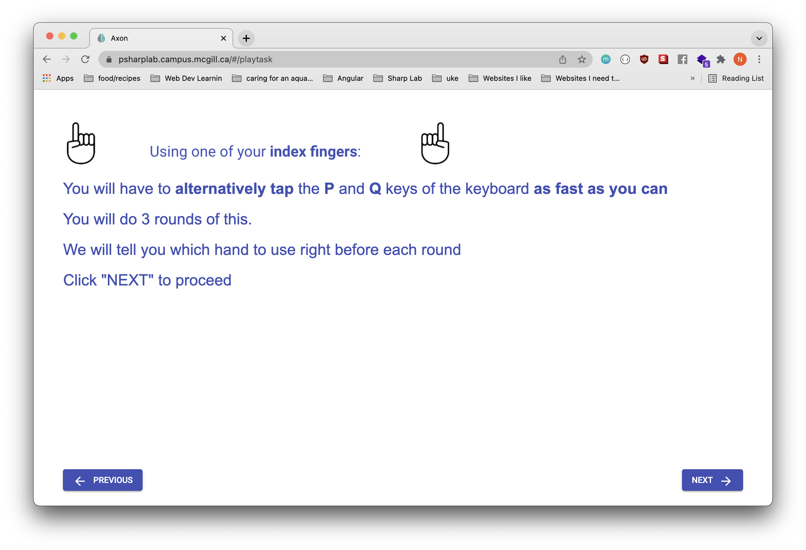
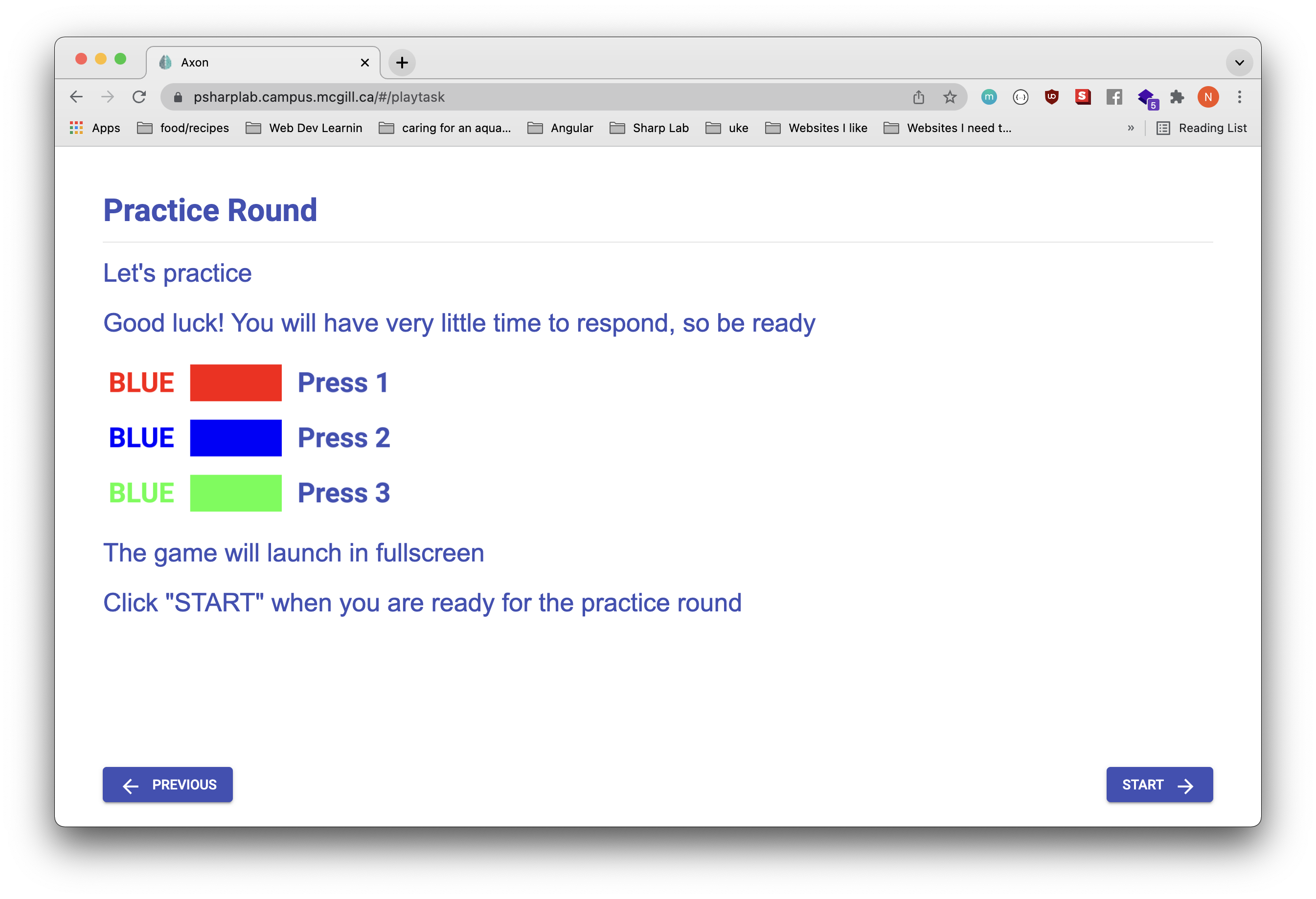
1. Text
{
  "config": {},
  "metadata": [
    {
      "component": "DISPLAYCOMPONENT",
      "content": {
        "title": "Some example title",
        "sections": [
          {
            "sectionType": "text",
            "textContent": "example text content"
          }
        ]
      }
    },
    ...
  ]
}
The first is the most basic example. The property "sectionType": "text" indicates that text will be rendered. Set the desired text for the textContent property.
textContent supports french/english language translations as well. To add french translations, the textContent should be given en and fr properties:
{
  "textContent": {
    "en": "hello world",
    "fr": "bonjour le monde"
  }
}
2. Images
{
  "config": {},
  "metadata": [
    {
      "component": "DISPLAYCOMPONENT",
      "content": {
        "title": "Some example title",
        "sections": [
          {
              "sectionType": "image-horizontal", // possible values are: "image-horizontal", "image-square", "image-small",
              "imageAlignment": "left", // possible values are: "left", "center", "right"
              "imagePath": "/assets/images/instructions/fingertapping/index-finger-banner.png"
          },
        ]
      }
    },
    ...
  ]
}
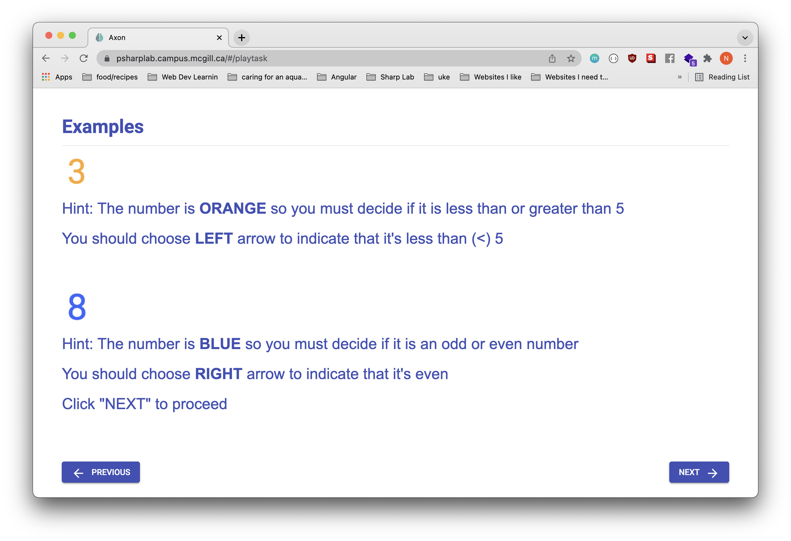
SectionType should be set to image-horizontal, image-square, or image-small if you want to render an image. The imageAlignment property should be set to left, center, or right. It specifies whether the image should be left, center, or right aligned respectively. The imagePath property must be set to reference the desired image. Note: the image must be uploaded in the frontend in order to reference them via an imagePath
Example of image-horizontal
Exanple of image-square
Example of image-small
(in this case, the "3" and "8" are images)
3. Timer
{
    "component": "DISPLAYCOMPONENT",
    "content": {
        "title": {
            "en": "Get ready!",
            "fr": "Sois prêt!"
        },
        "timerConfig": {
            "timer": 10000,
            "showTimer": true,
            "canSkipTimer": false,
            "skipAvailableAfterXSeconds": 5000,
            "countDown": true
        },
        "sections": [
            {
                "sectionType": "image-horizontal",
                "imagePath": "/assets/images/instructions/smileyface/countdown.png"
            }
        ]
    }
},
The timerConfig property should be set if you want to convert the slide into a timer. This can be useful if you want the participants to wait a certain amount of time before continuing on to the next slide.
- the timer property is the amount of time to wait in milliseconds.
- the showTimer property indicates whether to show the numbers counting down or not
- the canSkipTimer property indicates whether the participant is allowed to skip to the next section
- the countDown property set to true will have the timer count down, and false will have it counting up
- the skipAvailableAfterXSeconds works with the
canSkipTimer: trueproperty. Setting this property to a specific number will allow the participant to skip to the next slide only after that number of seconds has elapsed.
Questionnaires
Overview
Questionnaire config files are used to describe the questions included in the online form.
Questionnaire config files take this form:
{
  "title": "Some title",
  "questions": [
    {
      "questionType": "input", // possible values: "multipleChoiceSelect", "radiobuttons", "freeTextResponse", "displayText", "divider", "input", "slider"
      "title": "Age question",
      "textContent": "what is your age?"
      "validation": {
        "required":true,
        "isNumeric":true,
        "min":18
      },
      "key":"age"
    },
    { ... },
    ...
  ]
}
- The title property represents the name of the form displayed to the participant
- The questions property is an array of questions rendered to the participant
- The questionType property is the type of input to be rendered. Possible options are "multipleChoiceSelect", "radiobuttons", "freeTextResponse", "displayText", "divider", "input", and "slider"
- The title property is the title of that specific question
- The textContent property is the text content for that specific question
- The validation property is a configuration that allows you to apply specific validation rules to the rendered question
- The key property is a string that is used as the identifier for this specific question. This is also the value that will be used for this question when downloading the spreadsheet data for this questionnaire. In the above example, the spreadsheet would say "age" along with all participant responses. This must be unique.
Different questionTypes have different properties to set. More info on that below.
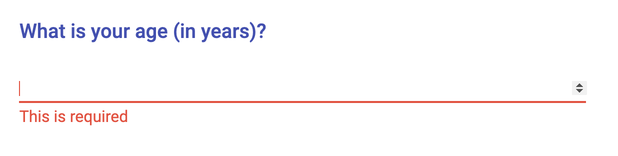
1. Input
{
  "title": "Some title",
  "questions": [
    "questionType": "input",
    "title": {
      "en": "what is your age?",
      "fr": "quel âge as-tu?"
    },
    "validation": {
      "required":true,
      "isNumeric":true,
      "min":18
    },
    "key":"age"
  ]
}
The most basic example is a input with "questionType": "input". This renders a basic textbox that allows the user to type a response. You can also supply a label: string property to provide the input with a label.
You can apply certain validations:
required: truemakes it so that the question must be answeredisNumeric: truemakes it so that the question must be answered with a numbermin: 18makes it so that the number entered must be at least 18max: 80makes it so that the number entered must be at most 80minLength: 20makes is so that the response must be at least 20 charactersmaxLength: 100makes it so that the response must be at most 100 characters
Note that all questionnaires accept french translations for the title and textContent.
Example:
Example: (input with label)
2. MultipleChoiceSelect
{
  "title": "Some title",
  "questions": [
    "questionType": "multipleChoiceSelect",
    "title": {
      "en": "What sex were you assigned at birth?",
      "fr": "quel est ton sexe?"
    },
    "validation": {
        "required": true
    },
    "key": "sex",
    "multipleChoiceOptions": [
      {
        "label": {
          "en": "Female",
          "fr": "Femelle"
        },
        "value": "female"
      },
      {
        "label": {
          "en": "Male",
          "fr": "Mâle"
        },
        "value": "male"
      }
    ]
  ]
}
This question type renders a multiple choice select component. This requires that the user select one option out of multiple possibilities in a dropdown.
For "questionType": "multipleChoiceSelect", you need to provide multiple choice options. In the above example, the multiple choice options are "Female" and "Male". multipleChoiceSelect takes an array of option objects. The option object has a label property which is the value that is displayed to the participant, and the value which is what will be saved as the response. The textContent property can also be used just like above.
Another property that you can add is the allowMultipleSelections: boolean property. This flag allows the participant to select multiple options instead of just a single one.
Note that french translations are supported for label values.
Example:
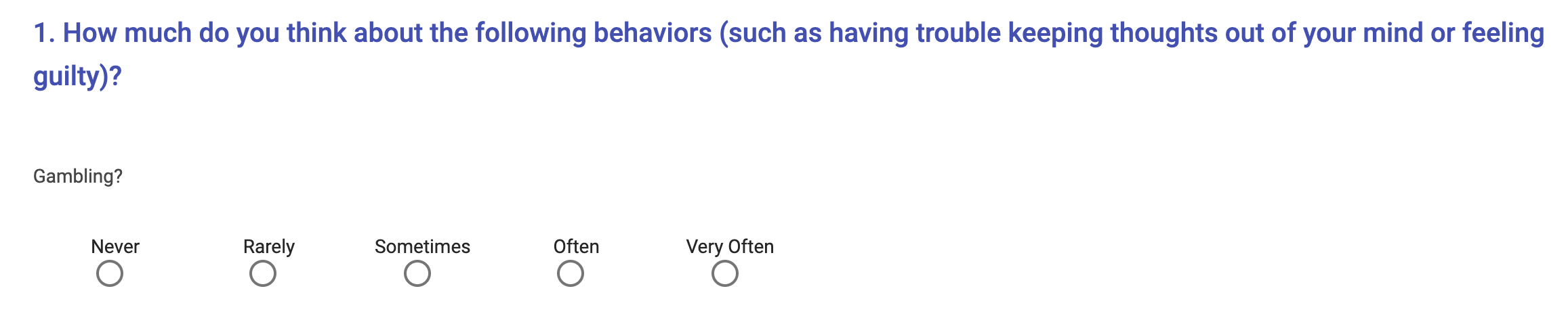
3. Radiobuttons
{
    "questionType": "radiobuttons",
    "radiobuttonPresentation": "horizontal",
    "textContent": {
        "en": "Eating?",
        "fr": "Manger?"
    },
    "validation": {
        "required":true
    },
    "key": "how much difficulty to you have controlling eating",
    "multipleChoiceOptions": [
        {
            "label": {
                "en": "Never",
                "fr": "Jamais"
            },
            "value": "never"
        },
        {
            "label": {
                "en": "Rarely",
                "fr": "Rarement"
            },
            "value": "rarely"
        },
        {
            "label": {
                "en": "Sometimes",
                "fr": "Parfois"
            },
            "value": "sometimes"
        },
        {
            "label": {
                "en": "Often",
                "fr": "Souvent"
            },
            "value": "often"
        },
        {
            "label": {
                "en": "Very Often",
                "fr": "Très souvent"
            },
            "value": "very often"
        }
    ]
}
This question type renders a group of radiobuttons. Radiobuttons work similiarly as the select question type - a group of options are rendered and only one can be selected at a time. You also need to provide multiple choice options under the multipleChoiceOptions property.
Another stylistic property you can pass in is radiobuttonPresentation. This recognizes "radiobuttonPresentation": "horizontal" or "radiobuttonPresentation": "vertical". This arranges the radio buttons either from top to bottom, or left to right depending on the desired orientation.
Note that french translations are supported and are shown in the above example.
Example: (horizontal)
Example: (vertical)
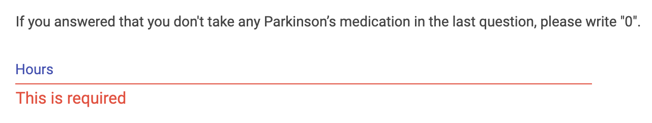
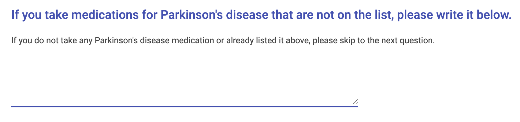
4. FreeTextResponse
{
    "questionType": "freeTextResponse",
    "title": "If you take medications for Parkinson''s disease that are not on the list, please write it below.",
    "textContent": "If you do not take any Parkinson''s disease medication or already listed it above, please skip to the next question.",
    "key": "PDMedsOthers",
    "validation": {
        "required": false
    }
}
This question type renders a text area input. That allows the participant to enter in a paragraph of free text instead of choosing from specific options.
Example:
5. DisplayText (decorative, does not accept input)
{
    "questionType": "displayText",
    "title": "The following questions are about the treatment you receive for your parkinson''s disease and for related conditions."
}
This question type renders a simple block of text. This is useful if you want the participant to read some text before answering questions in the questionnaire.
6. Divider (decorative, does not accept input)
{
    "questionType": "divider"
}
This question type renders a simple divider. It is a stylistic component that separates different sections of the questionnaire.
Example:

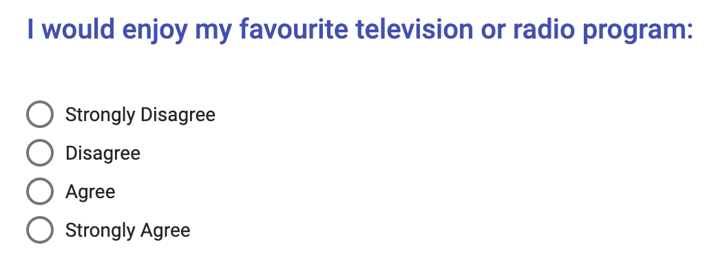
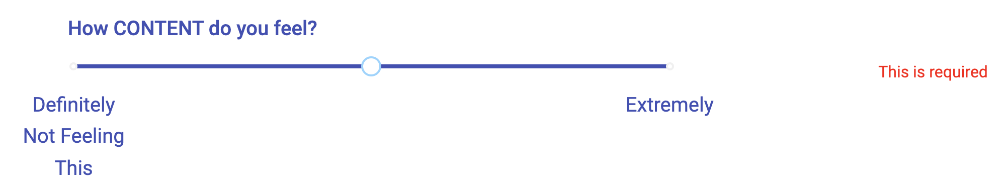
7. Slider
{
    "questionType": "slider",
    "title": "How CONTENT do you feel?",
    "validation": {
        "required":true
    },
    "key": "How CONTENT do you feel?",
    "legend": [
        "Definitely Not Feeling This",
        "Extremely"
    ]
}
This question type renders a slider. The participant clicks and drags an indicator from left to right in order to answer the prompt. The slider has an optional legend property which accepts an array of strings. The array of strings will be used as a legend to give the participant an indicator of what they're selecting. The legend strings will be spaced out automatically.
Example:
Info Display Slides
Info display slides are used in two different cases
- to display some info within a study that is not part of a specific task (i.e. a debrief slide or an intro slide)
- to show the intro or background for a specific study when the participant is directed there via the generated URL (i.e. a study background slide)
Info display slides take this form:
{
  "title": "some title",
  "sections": [
    {
      "header": "",
      "indent": 0,
      "textContent": "some text content"
    },
    {
      "header": "",
      "textContent": "..."
    },
    { ... },
    ...
  ]
}
- the title property is the title of the overall slide
- the sections property is an array of text blocks that are rendered in order.
- the header property is an optional title header that is on top of the text block.
- the indent property is an optional property that takes a number from 1 to 3.
- the textContent property is the rendered text displayed to the participant.
Example: (study background)

Example: (info display within a task)

Download and Install Go
Linux, macOS, and FreeBSD tarballs
Download the archive and extract it into /usr/local, creating a Go tree in /usr/local/go. For example:
tar -C /usr/local -xzf go$VERSION.$OS-$ARCH.tar.gz
Choose the archive file appropriate for your installation. For instance, if you are installing Go version 1.2.1 for 64-bit x86 on Linux, the archive you want is called go1.2.1.linux-amd64.tar.gz.
(Typically these commands must be run as root or through sudo.)
Add /usr/local/go/bin to the PATH environment variable. You can do this by adding this line to your /etc/profile (for a system-wide installation) or $HOME/.profile:
export PATH=$PATH:/usr/local/go/bin
Note: changes made to a profile file may not apply until the next time you log into your computer. To apply the changes immediately, just run the shell commands directly or execute them from the profile using a command such as source $HOME/.profile.
macOS package installer
Download the package file, open it, and follow the prompts to install the Go tools. The package installs the Go distribution to /usr/local/go.
The package should put the /usr/local/go/bin directory in your PATH environment variable. You may need to restart any open Terminal sessions for the change to take effect.
Windows
Open the MSI file and follow the prompts to install the Go tools. By default, the installer puts the Go distribution in C:\Go.
The installer should put the C:\Go\bin directory in your PATH environment variable. You may need to restart any open command prompts for the change to take effect.
Zip archive
Download the zip file and extract it into the directory of your choice (we suggest C:\Go).
Add the bin subdirectory of your Go root (for example, C:\Go\bin) to your PATH environment variable.
Setting environment variables under Windows
Under Windows, you may set environment variables through the "Environment Variables" button on the "Advanced" tab of the "System" control panel. Some versions of Windows provide this control panel through the "Advanced System Settings" option inside the "System" control panel.
Setting up the repository
Clone the repository
Use git to clone the repository:
git clone https://github.com/cognitive-neuroscience/neuron.git
Install the dependencies
The package uses Go Modules to manage dependencies. Install dependencies by typing:
go mod download
Run the package
Run the package by typing:
go run ./src/main
Run tests
go test -v ./src/* -race -coverprofile=coverage.txt -covermode=atomic
Build the package
Generate a binary build for your operating system by typing:
# For Windows
env GOOS=windows GOARCH=amd64 go build -o ./bin/windows/neuron ./src/main

# For macOS
env GOOS=darwin GOARCH=amd64 go build -o ./bin/darwin/neuron ./src/main

# For Linux
env GOOS=linux GOARCH=amd64 go build -o ./bin/linux/neuron ./src/main
License
MIT licensed. See the LICENSE file for details.
 Directories